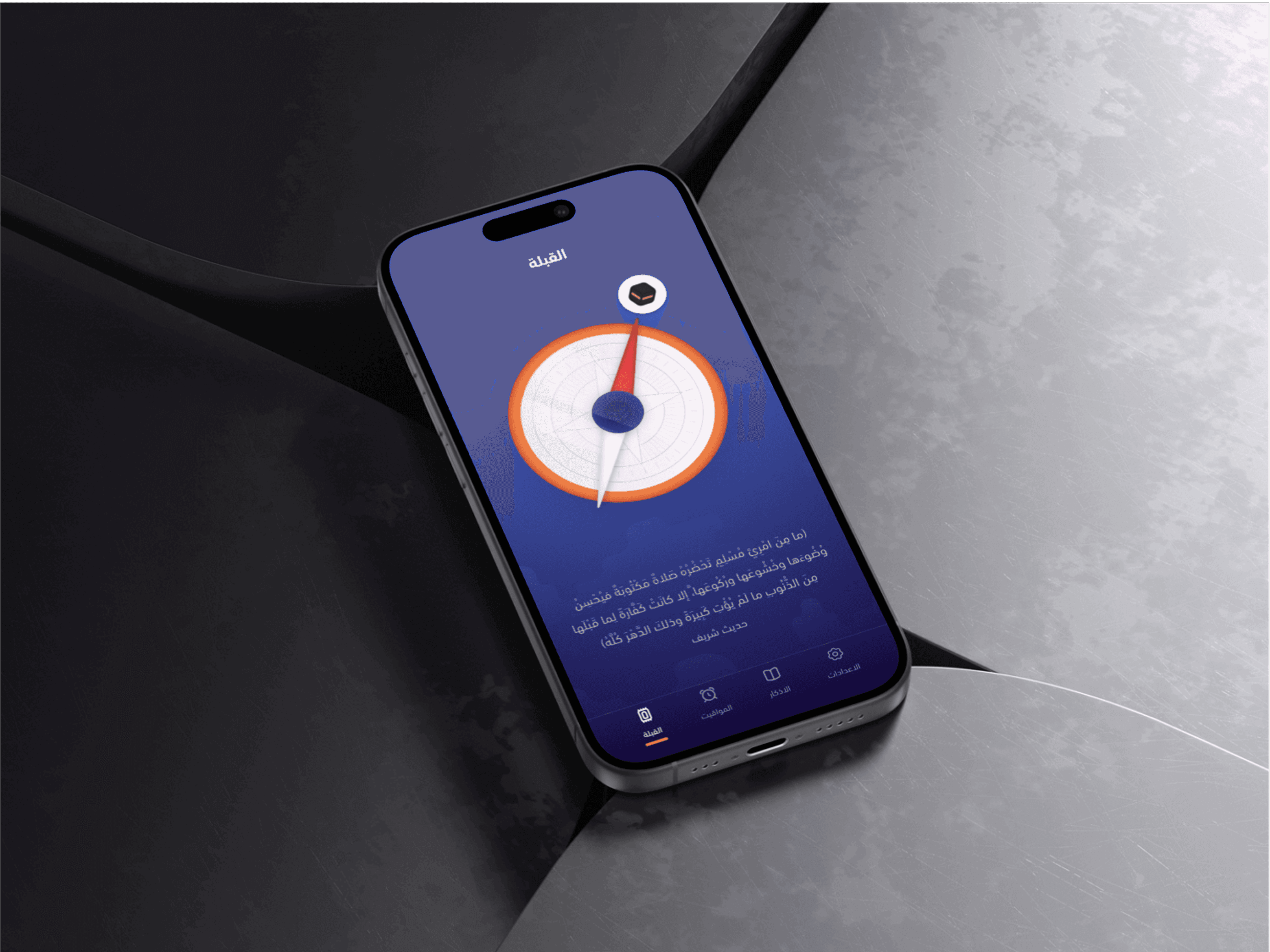
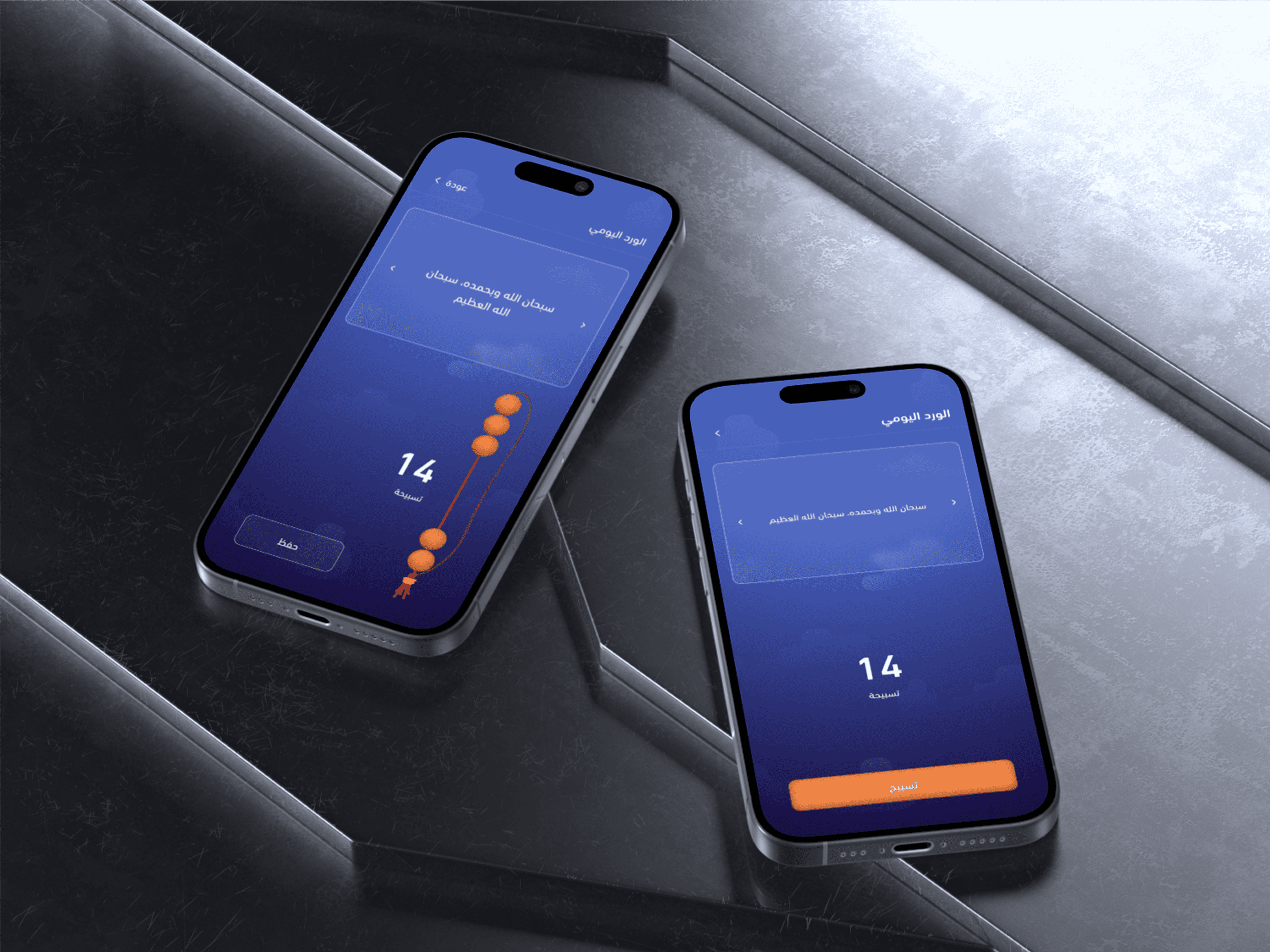
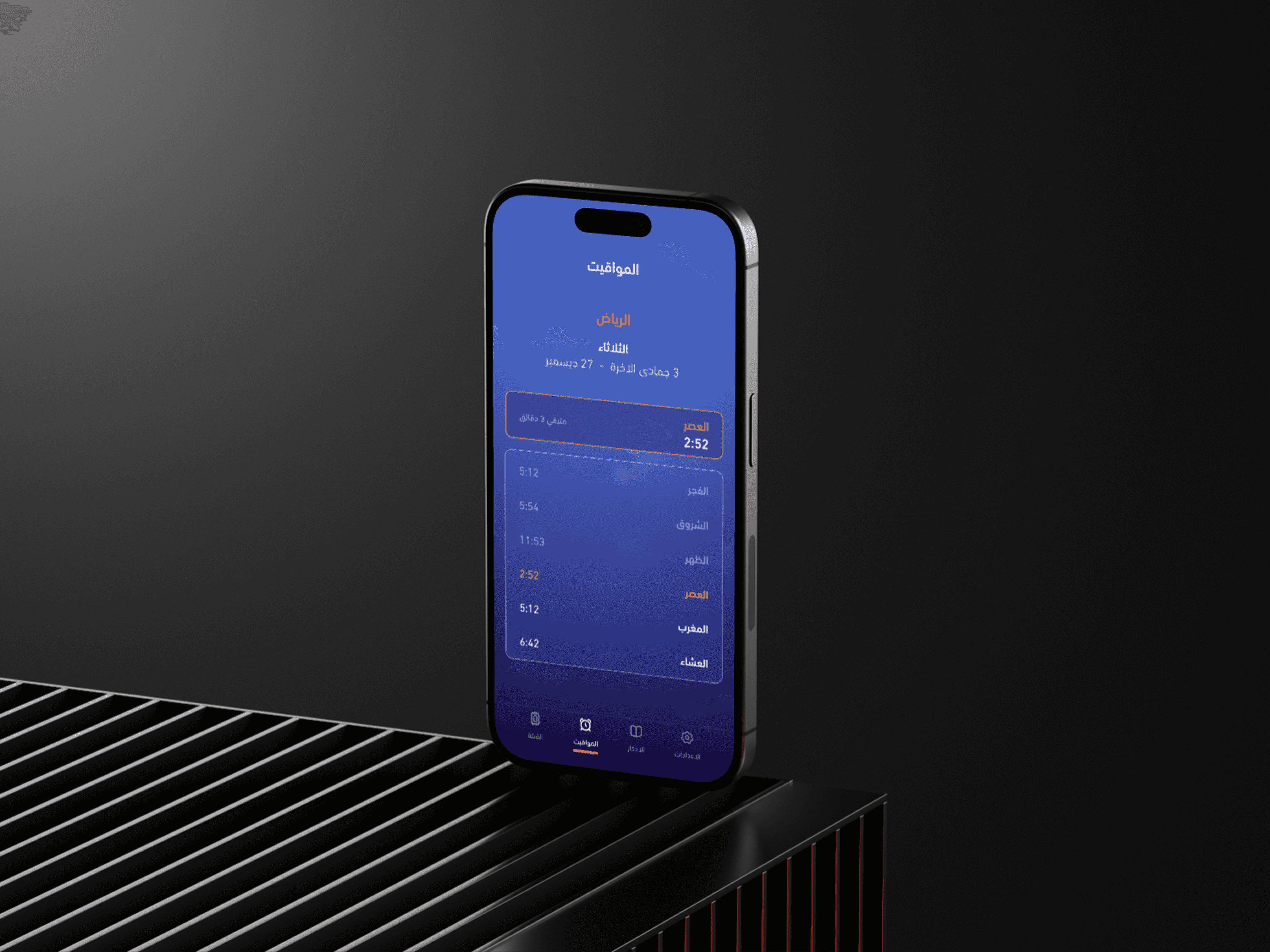
I wanted to rethink the visual language of Athkar apps and move away from the predictable UI patterns. Every detail was intentional (from the screen structure to the icon design) with a bold, fresh aesthetic. This was a space where I pushed my creative instincts and explored nontraditional visual flows. The name “Qurb” reflects both its spiritual meaning (closeness to Allah) and its emotional promise: the further you go into Qurb, the farther you are from karb (distress).
Sharing the design on social media sparked unexpected buzz and strong engagement.
A developer reached out and purchased the UI for further development.
This experience proved how bold design choices can resonate deeply and open new doors.
It sharpened my creative instincts and left me eager to challenge design norms again.
